Saturday, June 9, 2007

"Should I trust Google?"

Good article at the Financial Times about "Google's Goals..." [By way of John Battelle's Search Blog]. A quote in the piece from Google CEO Eric Schmidt, Google's CEO is either hyperbolic, or scares the crap out of me:

We are very early in the total information we have within Google. The algorithms will get better and we will get better at personalisation. The goal is to enable Google users to be able to ask the question such as ‘What shall I do tomorrow?’ and ‘What job shall I take?’ 

"What shall I do tomorrow?" "What job shall I take?"

Other questions that come to mind...

  • "Should I trust Google to make life-decisions for me?"
  • "Where have all the flowers gone?"
  • "How can we get out of Iraq most logically?"
  • "What number am I thinking of?"

When I get together with more than two-or-so friends, and we play the, "'What do you want to do tomorrow?" game... we spend at least half-an-hour shrugging, saying, "I don't know... whaddayouwanna do?" Debating Mexican vs. Greek food. Talking about what we did last time. Answering phone calls from people who "might join up... depends on what you're doing." Etc. Etc. Etc.

I guess, if Google could aggregate all of our personal search information at the same time -- maybe through an online group profile, I'd be interested in answering the question, "What should we do tonight?" as it would save scads of time.

I expect the answer would involve clicking on several ads for restaurants, movies/shows, music choices, etc. If Google ever spoutted back, "You should just hang out and talk and eat some of the great new cheese that Bill has in the fridge," my head would explode. 


New blog project: Kid Vid Id

So... My 7-year old comes in and says, “Dad… Moms says I’ve got 10 minutes to go before bed, and I’m supposed to bug you so that I’m not bugging her.”

“That’s cool. Whaddya wanna do for 10 minutes?”

He thinks for a bit, then says, “I want to watch some funny turtle videos on YouTube.”

My wife and I get lots of links to various Internet videos, and find them ourselves during the course of being normal Web-using folk. Many of them are fine to share with the boy… many of them are not. We watch with him, so we can tell what’s going to be appropriate. But sometimes it’s hard to tell, on the fly, what’s what…

I asked him, “Were you looking at turtle videos before?”

He said, “No. But Mom’s showed me other funny animal videos on YouTube, and I’m thinking about how I may want a turtle, and figured there’d be funny turtle videos on YouTube.”

He was, of course, right. We found “Turtle vs. Cat” very quickly, and then a couple more. Neat stuff. Took about 12 of the 10 minutes Mom had given him, and off he went to bed.

While searching for funny turtle videos, though… I found some that I would not ever share with a kid. Because “funny” means lots of things to lots of people. Sometimes it means stuff that a kid wouldn’t get, like stand-up comedy. Sometimes it means really, really rude stuff that you don’t want your kid to see, let alone understand at the age of seven. For some people, apparently, teenagers skateboarding off the roof of their garage and breaking a bone qualifies as “funny.”

I started looking for more funny videos that were appropriate for kids. And it was harder than I thought. In many cases, you have to wade through a lot of junk in order to find a good one. In some cases, videos tagged with “funny” and “kid” are videos about kids doing funny things. Which is fine… but not what I want to watch with my kid all the time.

So I figured, if I was going to put effort into finding videos I’m OK sharing with my 7-year-old son… why not share them with other people and their kids? Thus, the idea for KidVidId was born.

Why the name? Well, hopefully, the “Kid” and “Vid” parts are obvious. I added “Id” to stand for both “ID,” as in “identification” — a way to ID good vids for kids — and because “id” also means the part of you that likes stupid videos. As opposed to the “ego” which likes videos of your own kids, and “superego” which likes doing things not involving Internet video.

All the videos at the site are pre-screened to be OK for kids. And by “kids” I mean my kid and his friends. I’m plunking down an “average” here, and if you still find some of the stuff  inappropriate for your kid, I’m sorry. It will all be PG or G stuff, won’t encourage violence towards others, may be educational or funny, or just interesting. Use the category tags.

If any TinkerX readers know of blogs/sites that cater to kids, parents, funny videos, cats, inventions, juggling, etc., and think they should have a link or post about KidVidId, please pass along the URL, as I can use all the link-love I can get.

Tuesday, June 5, 2007

50+ legal marketing posts

For a year and change, I was doing legal marketing consulting full-time. During that period, I wrote a legal marketing blog (often called "blawgs") that was consistently in the top 10 results on Google, Yahoo! and MSN search for the phrase "legal marketing." For those who don't speak SEO, that either means my blog was very popular in the legal marketing crowd, or that there weren't that many legal marketing blogs. Or both. The blog averaged around 300 unique readers per post, and topped out around 550 for subjects that got some attention elsewhere in the blawgosphere.

Well, when I stopped doing full-time consulting, I sold the blog to Larry Bodine, who rocks very hard in the legal marketing realm; I wanted someone to keep the thing going, since I'd spent so much time building up a good readership. So he kept the thing going for more than a year, but then consolidated his new writings on his other professional marketing blog.

Well, that means that the blog just probably ain't gonna be out there forever. So, to make sure that all ya'll won't ever suffer from a total lack of pithy Andy-style legal marketing wisdom, I've now collected them all here for your... pleasure. Or whatever.

I had fun writing them, and made lots of good contacts from the blawg. So it's a nice memory for me, too.

Sunday, June 3, 2007

Experiment in social free-ness

I've been pimping TaleWeaver, my creativity/storytelling book/game for some time now. Between the newer one (which is better) on Lulu, and the one that got up on Amazon through no fault of my own a few years back, I've sold about 50 of the things, netting around $200. Which ain't bad, considering I created the game as a personal gift for my wife and son. That dough just about paid for the sets I personally had printed/cut at Kinkos a few years ago for friends.

Clearly, though, I did not do it for the money. And I'm getting into some social spaces to see what kinds of benefits they have. At this point, here are my findings:

  • MySpace: I can't keep it up enough for it to matter. I've got multiple blogs on my own, and blogging from MySpace seems... odd to me. Maybe I'll try just copying my posts from here, but that also seems lame. I really tried to get into some groups, but the ones that have anything interesting in terms of content have enormous numbers of users, and the signal-to-noise ratio is huge. I don't have enough friends that use MySpace to make the "wall-to-wall" form of communication any kind of meaningful, though I can see how it would be for someone whose buddies are all in the space. Mostly I get random friend invites from strippers and bands. None of whom return my calls...

  • LinkedIn: I've been using this site longer than any of the others. I have 67 direct connections as of the moment, all of whom I can actually claim to have known in real life or to have met online (eLationships). As of yet, it has been entirely worthless to me. I tried, several times, in my full-time consulting days, to establish clients or partners for projects. Some were in that first circle, some were one-step away, requiring an intro. Nothing came of any of it.

  • Facebook: I've been on Facebook the least amount of time... and it is proving to be the most interesting to me. Why? Because I have connections there both from work (OCLC) and where I teach (CCAD). I've actually had days where I get two or three pings from the network, and I'm enjoying the kind of "casual / formal" feel. It's formal, because everyong there has a current, meaningful reason to be connected. Casual, because not all the messages and moments are related to work/business, as is the case with LinkedIn.

So... Since I'm getting value from my Facebook account, I'm trying an experiment: I'm putting value back in. I found a widget that lets you upload files to your Facebook page. So I've put a free, PDF version of the TaleWeaver book and cards up there for download by anyone in my networks. And I put an ad stating such in the Facebook marketplace.

I'm testing to see if it does one of three things: 

  1. Makes people happy to get a free download of something they find even marginally interesting.
  2. Gets me more Facebook friends.
  3. Moves more copies of TaleWeaver from my Lulu store.
I'm not really counting on any of this. I hope #1 happens, at least. I'll report back later on the others if anything of note happens.

Saturday, June 2, 2007

Pushing the brand out: Absolut "Pillow Fight" ad is spot-on

If you haven't seen the new Absolut TV ad, check it out here and come back.

[Yes, at some point I'll figure out how to embed videos right in the blog. It needs a plugin and I'm having issues with FTP today, if you care... ]

So. It's a good ad, clearly, from a direction/production standpoint. Good timing, funny, unexpected... I would go so far as to say that it is "joyful," which is really rare in ads that are supposed to be funny. Most funny ads are funny because they're just gonzo or weird or poking fun. None of that here. Just... the world's largest pillow fight.

But what transforms it from being just a good ad into a great ad, is that it fits so well with a couple decades of Absolut's print advertising from a brand standpoint.

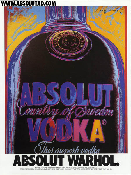
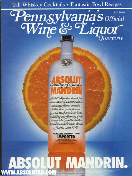
There are hundreds to look through. One of my favorites is:


Which was the first I'd seen that was related to a person or style as opposed to a flavor or event, like this:


Since then there have been all kinds of ads. But they all feature a theme that visually answers the question, "What would this subject look like around/within the Absolut bottle?" The metaphor (or "gag" if you prefer) takes the outside wold and imposes it on the brand in an artistic, interesting, funny way.

Which is what's so brilliant about the pillow-fight ad. It cinematically answers the question, "What would the world be like if it was seen through the lens of Absolut." It takes a concept that was focused on pulling outside elements into the brand space, and then reverses it -- pushing the brand space out into the world.

This works better, of course, if you know the print campaign, but it's not essential. The words I'd used to describe the TV ad -- funny, fun, creative, interesting, unexpected -- are all ones that work with the print campaign, too. The fact that the print ads are so well known helps, of course. I don't think the ad would have been 1/10th as good if it had turned out to be the exact same spot... but for another brand of booze.

This process illustrates something similar to a creativity tool/exercize I've used with writing students: you take the metaphor of the piece you're working on and flip it, or take a theme and reverse it, and re-write the piece.

For example, if you've written a poem that describes the haunting feeling of deja vu in terms of being followed by a copy of yourself... flip the metaphor. What does it mean to be "followed by yourself?" That could also be a metaphor for paranoia or insecurity, but that's not the point here; we're not trying to re-use a metaphor, but flip it entirely... take the internal and push it out. You might write a poem about how when you closely examine whatever you are doing, it tends to seem like deja vu. Even new events and activities become less interesting if you're forever examining yourself. You never get to do something "fresh" if you're under your own microscope. Then deja vu becomes the metaphor for, "It seems like I've done this before."

See? Fun and new ideas for a piece based on flipping the theme or pushing it out. Absolut could have gone with an easy-peasy (and bad) TV implementation of their print commercials; you can almost picture it, can't you? Patrons around a bar shaped like the bottle... the bottle shape appearing in various locales as people do fun, drink-y stuff. It might have worked... but it would have been shallow.

What they did instead shows a real understanding of the brand on the part of their agency, and some real poetic thinking in terms of the creative.

Ask yourself, when crafting an ad or any kind of creative work, what would the world look like through the lens of this brand? If this product or event or theme were itself the icon of  by which people lived their lives... what would they do?

The TV ad answers the question, "What happens in an Absolut world?" Do that for your stuff.

Thursday, May 24, 2007

Literary dissonance: hating Helprin, loving the work.

So I'm going to Nashville to see my folks for an extended-long weekend, and I needed some books to read, as I'm low on fun stuff. Just today, I wandered into B&N, and I notice that Mark Helprin has a new novel out, "Freddy and Fredericka." Not real new, but it's his first in almost 10 years, and I hadn't seen it before, so it's exciting. So I bought it.

For awhile, now, I've known that I don't like Mark Helprin, the person. We don't need to get into the reasons, but we disagree on lots of policy issues. He's a senior fellow at the Claremont Institute. You can check out their info if you want to. But that's not the point.

I got back home today and was reading up on my news and blogs and got pointed from several sources to a NYT op-ed piece from last Sunday that Helprin wrote, titled "A Great Idea Lives Forever: Shouldn't It's Copyright?"

Thanks, blogosphere. I was trying really, really hard to forget that I don't like Helprin. For at least long enough to read the new novel. Did I say it was the first new Helprin novel in almost 10 years? Did I mention that I think his "Winter's Tale" is one of the best novels I've ever read?

But, noooo. Less than 3 hours after buying the book, I get whammed with the NYT piece. Now I've either got to really work on forgetting that I dislike this guy, or put the book on the shelf for awhile. O, fudge.

It's not like I need to love-love-love all my favorite authors. They're people. I'm a big guy (in both ways). I can look past all kinds of mortal shortcomings to enjoy the fruits of their artistic effort.

But, man... the delta between my appreciation for Helprin's prose and my outright scorn for many of his public ideas is vast.

How do I cope? Any suggestions welcome. At this point what I'm pretty much going to do is focus on how much of an ass I am... while still hoping that people enjoy my work. You know, "Do unto others." If folks can put up with my BS and still read any of my prose... well, perhaps I can look past Helprin's hypocricy and....

NO! Must stop... must... just... treat him... as... disembodied source of reading joy...

Hard... so hard.... 

Sunday, May 20, 2007

The Uncanny Peak of Wrong Metaphors

Last week, Tim O'Reilly wrote about a Bill Higgins post called "The Uncanny Valley of User Interface Design."

The metaphor Higgins brings to the table to help explicate his point is that of "The Uncanny Valley," which Higgins explains well. For those unfamiliar with the concept, the basic idea is that we feel more and more empathy towards robots (or non-human characters, such as animated cartoons or video game avatars), as they begin to express more human features. At some point, though -- the edge of the Uncanny Valley -- they become too lifelike for comfort, but not lifelike enough to really fool us. Something is missing. Their appearance strikes us as just... wrong. Odd. Uncanny.

Higgins goes on to cite two films that are often used as examples of having fallen into this valley;  The Polar Express and Final Fantasy. I've seen both films, and I agree (especially in the case of The Polar Express... it just ain't right for some reason).

It's a well-thought-out article that has, as its main premise, the idea that the user interface for a piece of software should:

"...remain consistent with the environment in which our software runs. In more concrete terms: a Windows application should look and feel like a Windows application, a Mac application should look and feel like a Mac application, and a web application should look and feel like a web application."

So, the metaphor here, linking software UI to robotics/animation, is that we want something to not behave and/or appear to be too strangely like something else, while not actually being exactly like it. His main point is that Web aps that try to look like desktop aps, and vice versa, aren't really doing anybody any favors.

Though well written and supported with a couple good examples, I disagree with the premise, and I think the metaphor is badly chosen. 

Metaphor first. We all expect people to look like people because, for the most part, people look like people. There is an instant -- some biologists/anthropologists argue, innate -- connectivity at birth between newborns and human faces. We respond to smiles. We track eye movements. We can, without any training, mimic facial expressions. We are hard-wired, at least emotionally, and probably chemically/biologically, to know the human face better than almost any other object in the world. When you work with human faces -- as an artist, cartoonist, director, animator -- you are dealing with one of the most sensitive and universal inputs/outputs available.

What does a "link" look like, biologically speaking? Or a block-quote, menu bar, button, etc. Yes, there are conventions... which change. Yes, currently a Windows ap looks different than a Mac or Linux ap or a Web ap. And if you gave me a program that looked 90% like Microsoft Word -- one of the most succesful and widely used programs on the planet -- but then had a couple fundamental features that were radically different... I'd probably have some issues with it. At least from a learning perspective, possibly from an adoption one as well.

Unless those differences were really cool and easily grasped.

Time and time again, I've used new software that broke some existing UI rule or convention... and surprised me pleasantly. When done well. I will agree with Higgins that purposefully making an ap look like what it's not in order to glean some kind of borrowed brand shine is a bad idea. The plethora of "Web 2.0-y" glowing buttons, 3D tabs and various shiny bits, when applied to standard interface elements is, frankly, goofy.

Some might argue that much of this 2.0-look is an attempt to make Web aps look more like their desktop counterparts. In many cases, I expect that is the case. Design in everything follows trends. Designers often work for clients who don't understand the underlying design reasons, but can keep their eye on trends and popular elements and who want their little slice of the Web to look "cool like that link I sent you the other day. Make it cool like that." It doesn't matter that the site design being changed is one with a standard home page and six children, and the one being emulated is a robust, interactive, social application with all kinds of moving parts. "I want it to look cool like that" is, I think, as major an influencer of UI design as it is of fashion in any industry.

All that being said, however... I have real problems with the idea that UI needs to "look like" what it used to look like, or "should" look like at some level that, according to this metaphor, is emotionally equatable to that of the human face.

Higgins gives as an example, Zimbra, and compares it to Gmail. He says: 

"To me, Zimbra doesn’t in any way resemble my mental model of a web application; it resembles Microsoft Outlook... On the other hand Gmail, which is also an Ajax-based email application, almost exactly matches my mental model of how a web application should look and feel... I prefer [Gmail b]ecause over the past twelve years, my mind has developed a very specific model of how a web application should look and feel, and because Gmail aligns to this model, I can immediately use it and it feels natural to me."

Here's my problem with that. For me, "email" is the "human face" of this metaphor, rather than the development/deployment platform. Users (like myself) who have spent 12 years in corpoate environments with various versions of MS Outlook would find Zimbra much more "natural" than Gmail. I have a Gmail account, and don't use it much, partly because I find the UI to be so much different than MS Outlook, which is patched directly into my cerebral cortex for about four hours a day.

For Higgins, humanity is found in the platform. For me, it's found (in this case) in the tool interface. He thinks a Web ap should look like a Web ap. I think that email should look like email... and, for me, that means Outlook. I'm not saying I'm right -- but that different definitions of "natural" in a software design context need to be considered. In the end, what works is natural. It's not turtles all the way down for UI development; we can actually do things as businesspeople and managers to see if our users respond well to various changes.

We only have one model (though billions of examples, obviously) of the human face. It is uncanny, indeed, when a replication of it gets close... but not quite close enough. In software interface design, I'm not sure that there is a universal model. And, if there is one, that it would be at the platform level. MS Word, Photoshop, TrueSpace, World of Warcraft... I run all of these on Windows XP. If they are all examples of what should "feel natural" for a Windows ap, then our anthropomorphic uncanny valley would be filled not with proto-human forms... but with lions, tigers and bears.